Rajdhani

Creating a Distinctive Brand Identity for an Indian Restaurant in the UK

Client :

Rajdhani

Indian Restaurant, Bishop’s Stortford, UK

Industry

Hospitality / Restaurant

The Brief

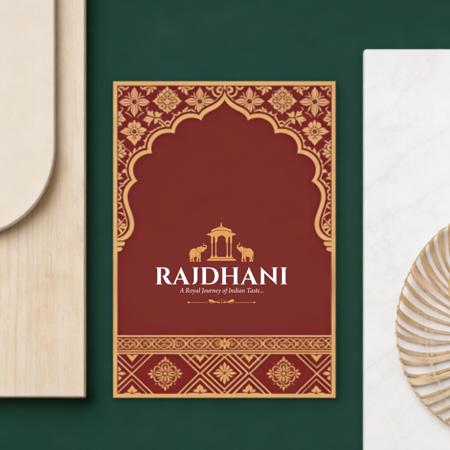
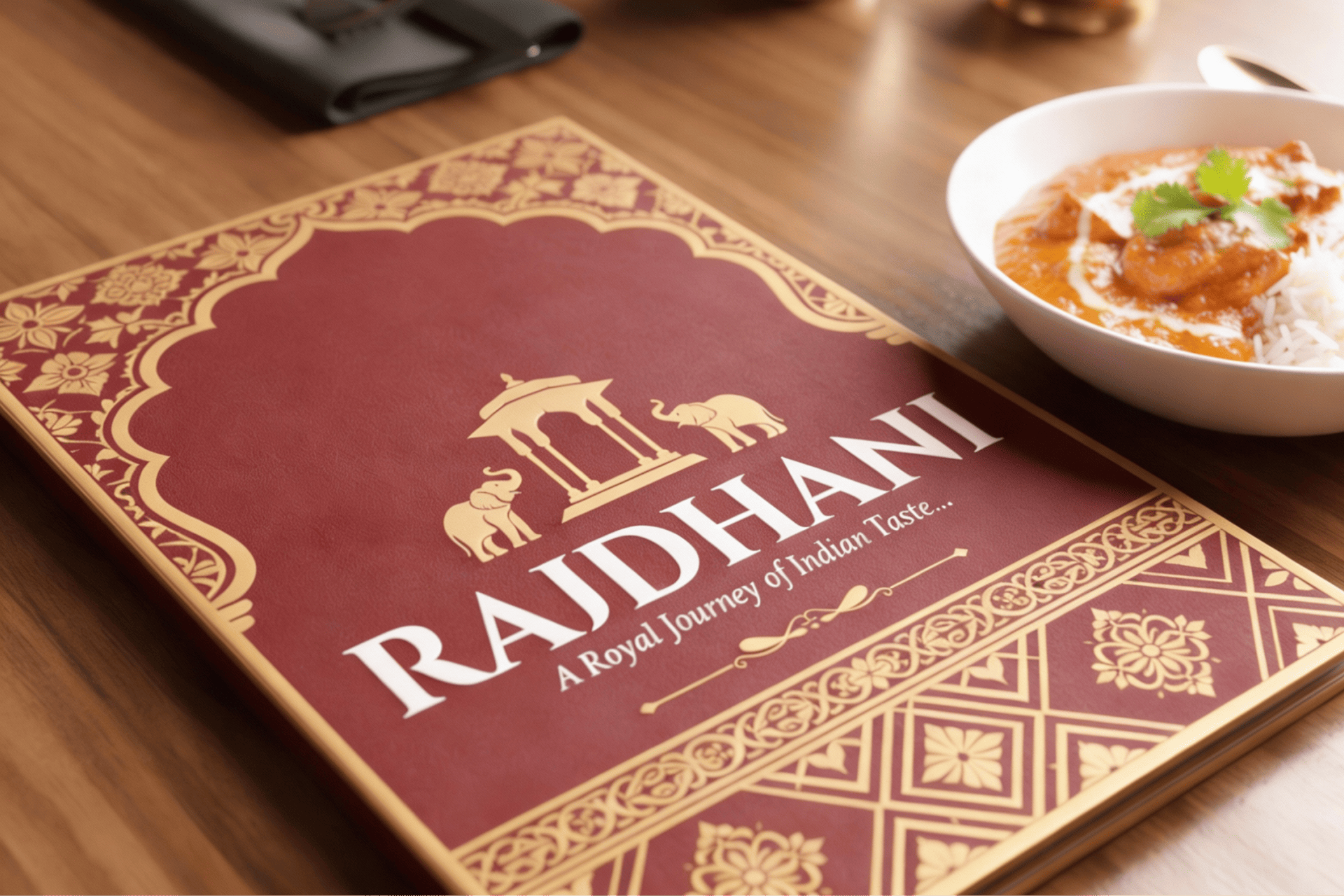
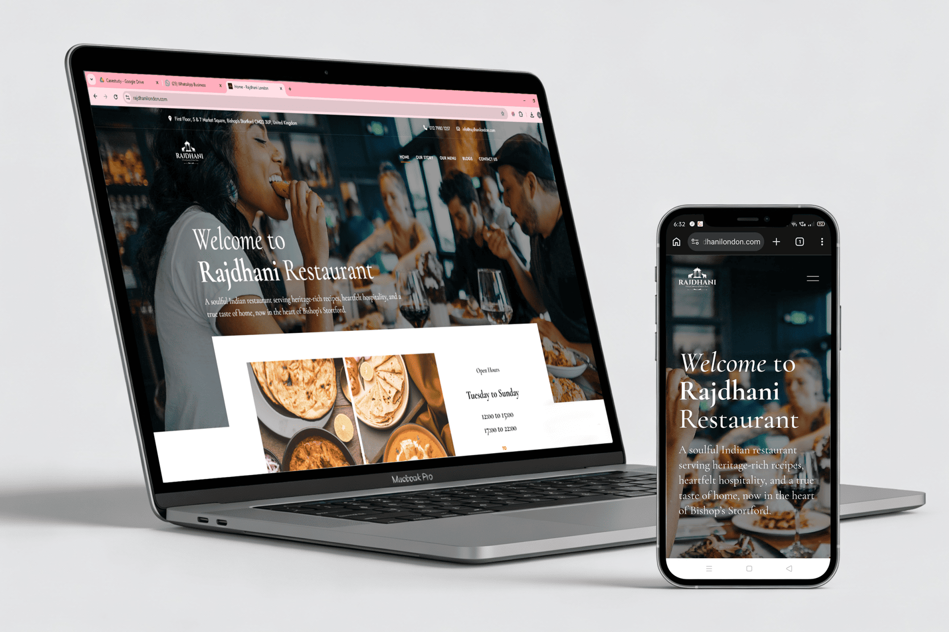
Rajdhani is a local Indian restaurant in Bishop’s Stortford, UK, offering authentic Indian cuisine with a strong cultural connection.

As a local business with unique dishes and limited direct competition, the focus was not on digital growth or SEO. The priority was clear:

Build a strong, memorable brand identity that reflects authenticity, culture, and pride.

The Brand Story

The name Rajdhani was inspired by the owner’s roots.

The restaurant owner is from Satara, Maharashtra, which was once a capital city. The name “Rajdhani” (meaning capital) reflects heritage, leadership, and authenticity.

This story became the foundation of the brand.

Our Role

Anaahat was engaged for end-to-end branding, including:

  • Logo design
  • Brand identity development
  • Menu card design
  • Website design

The goal was to create a brand that felt royal, rooted, and culturally rich, while still appealing to a UK audience.

The Story

We provide digital experience services to startups and small businesses. We help our clients succeed by creating brand identities, digital experiences, and print materials. Install any demo, plugin or template in a matter of seconds. Just select the demo and click OK. It’s that easy! The latest design trends meet hand-crafted templates in Ave Collection. Use pre-built sections to speed up your design process. Open a beautiful store, increase your conversion rates and boost your sales in minutes with object-oriented UX.

Approach

We provide digital experience services to startups and small businesses. We help our clients succeed by creating brand identities, digital experiences, and print materials. Install any demo, plugin or template in a matter of seconds. Just select the demo and click OK. It’s that easy! The latest design trends meet hand-crafted templates in Ave Collection. Use pre-built sections to speed up your design process. Open a beautiful store, increase your conversion rates and boost your sales in minutes with object-oriented UX.

The Branding Approach

1.Logo Design

The logo was designed to visually represent the meaning of Rajdhani.

Key elements:

  • ‘Damabari’ motif, inspired by traditional Indian architecture
  • Elephants on both sides, symbolising royalty, strength, and heritage
  • Balanced composition to reflect elegance and authority


The logo instantly communicates Indian origin, tradition, and pride.

2. Brand Identity

The overall visual language was designed to:

  • Reflect cultural richness without being overpowering
  • Feel premium yet welcoming
  • Stay consistent across physical and digital touchpoints


Colours, typography, and layout were aligned with the royal and traditional theme.

3. Menu & Collateral Design

Menu cards were designed to:

  • Highlight the uniqueness of dishes
  • Be easy to navigate for local customers
  • Maintain visual consistency with the brand identity

The design supported both dine-in experience and brand recall.

4. Website Design

The website was created as a brand experience, not a traffic tool.

Focus areas:

  • Clean presentation of food and ambience
  • Clear brand story and visual consistency
  • Easy access to menu and restaurant information

SEO or digital campaigns were intentionally not part of the scope.

The Outcome

  • A strong and distinctive restaurant brand
  • Clear cultural storytelling through visuals
  • Positive feedback on:
      • Logo
      • Website
      • Overall brand identity

  • High recall and appreciation from Rajdhani’s customer


The branding helped Rajdhani establish itself as a recognisable and authentic Indian restaurant in Bishop’s Stortford.

Why This Worked

  • Clear focus on branding, not unnecessary digital tactics
  • Strong cultural narrative driving design decisions
  • Consistency across logo, menus, and website
  • Respect for local business context and audience

The Result

  • Rajdhani launched with a confident, rooted, and memorable identity—one that reflects its heritage while standing out in the local market.

Looking to build a brand with meaning, not just visuals?

  •  
Prev Project
Kleanwise
Next Project
Katdare

all Projects