Kabade RaisinsLOGO & POUCH DESIGN

Cultivating Tradition, Crafting Excellence
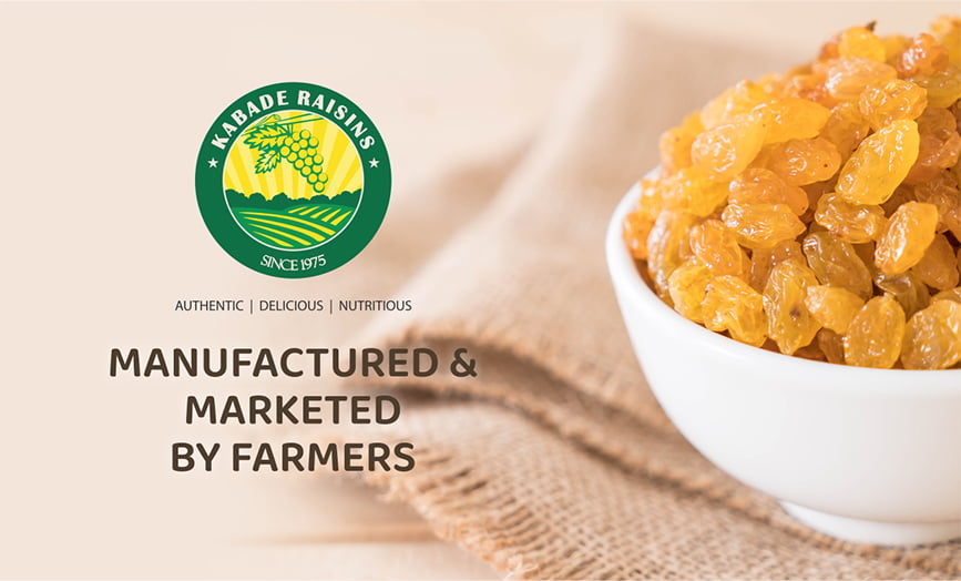
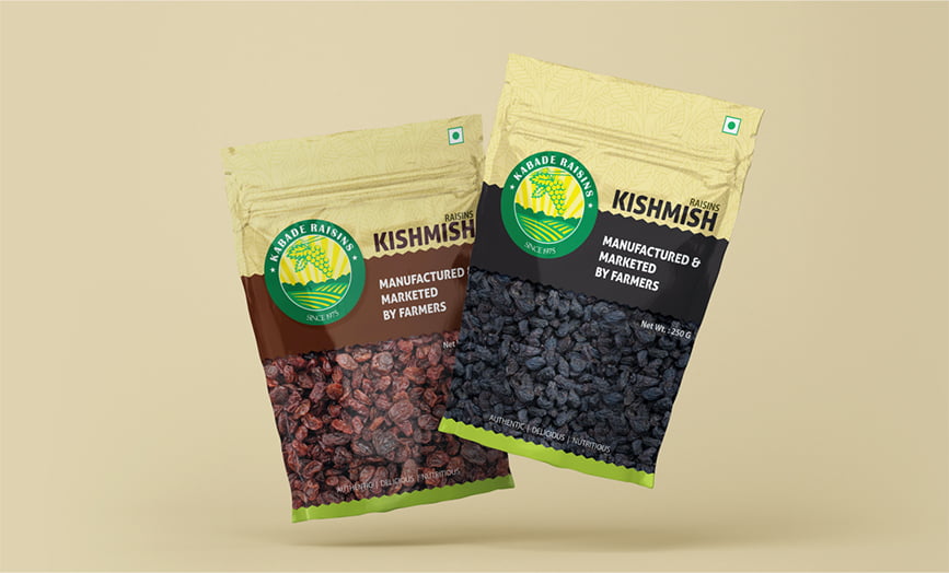
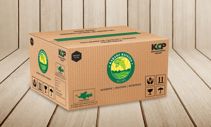
With a legacy dating back to 1975, Kabade Raisins stands as a pioneer in large-scale grape production. For their logo and packaging design, we envisioned an emblem that symbolizes their rich farming heritage. The circular shape signifies their end-to-end approach to production, processing, and storage, offering a seamless experience. Our punchline words – Authentic, Delicious, Nutritious – encapsulate their brand ethos perfectly.

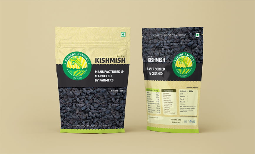
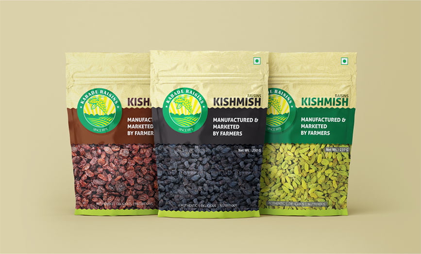
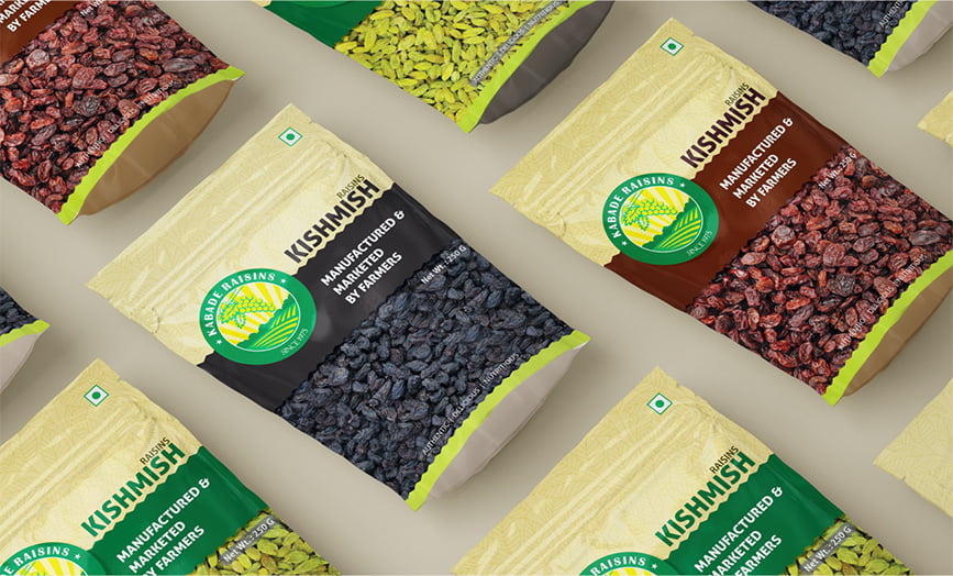
In our pouch packaging, we aimed to reflect their commitment to authenticity and quality. Through high-resolution images, we showcased their diverse range of raisin varieties. Grape leaf line art adorns the upper section, adding a touch of imagination and attention to detail. As Kabade Raisins enters the B2C market, we’re confident that their brand will soon set the gold standard. We’re thrilled with the outcome and look forward to continued collaboration with their team.
CLIENT
Kabade Raisins
CATEGORY
Food, Beverages & Apparels
DATE
December 26, 2018
As we began to plan out the implementation details, and started to make design decisions, it became clear that changes would need to be made to the architecture defined in the previous assessment. At the start of the assessment, we scoped out which requirements and features we wanted to implement by the assessment deadline. We used the assessment brief provided to us and and took into account the amount of time we had until the assessment deadline to determine how far we wanted to take the project and what features we wanted to implement.

